CHS-TONIGHT, PART 3: ACHEIVE HIP MINIMALIST STYLES BY NOT HAVING FUN
Hello! It's been a while since my last post. I have no excuse. So without further distration, let's dive into the next part of my chs-tonight series!
Style is a funny thing. It's not necessarily my forté, although it's definitely not unlearnable to some extent.
Let me tell you a story.
When I was a kid, I wanted to be a cartoonist. I believe I sent the Universal Press Syndicate a letter asking how to become a successful cartoonist when I was five or six years old. They never got back to me and I abandoned my dream.
All my life, I've known people who can sit down and create fantasatic drawings as easily as putting on velcro shoes. They simply had an eye for lines and color and shading. The world I create when I draw is one of nightmares, where beings with giant, flounder-eyed, malformed heads and oval bodies struggle to pick things up with their seven-fingered pyramidal lump-hands that would make Edward Scissorhands even sadder than he was.
Early on in my web development career, I designed a website that, while extremely functional, looked so bad that the first person I showed it to laughed and said that potential employers won't get the joke.
The original version of xoxodan looked like this:
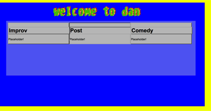
So, yeah. Design is not my forté. BUT! I learned that creating an attractive minimalist design (minimalism is great because it will, for the most part, never go out of style) is extremely simple if just just remember to not have fun with it.
This is what chs-tonight looked like in my first design:
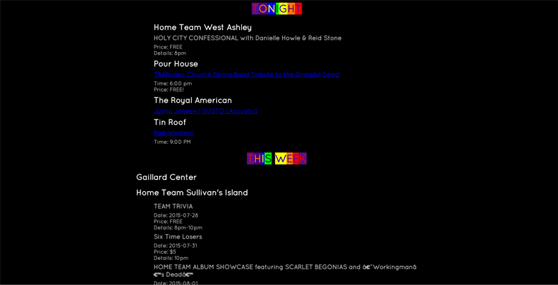
Not great, but to be totally honest with ya, I really still love the rainbow headers. However, switching to a white background with black text kinda killed the rainbows:
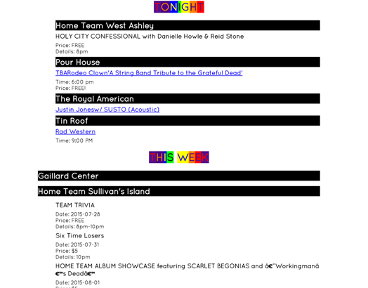
I switched to a while background because I read some article about how white text on a black background causes more eye strain than the reverse. Granted, chs-tonight is not supposed to be viewed for any extened period of time-- the whole point is that you check it out and move on. But the fact remains that, while I think the black background with rainbow headers has more character, the stark white background with black text and no rainbows looks more...professional.
And that's what we all want, right? We all want to seem professional instead of doing what makes us happy. ALL IN THE HOPES that other people, more important people, will take us seriously. All in the hopes that it'll pay off monitarily one day. Sigh.
Anyway, I settled on a boring ol' white background with boring ol' black text. I went crazy and took the liberty to have red links to individual events that invert the colors when you mouse over them. Because I'm a wild maniac who can't be caged.
Originally I wanted a monospace font because it made the rainbow header (R.I.P) look better. However, it was hard to find a free-use monospaced font that also didn't make it look like I was born in 1925 and never quite got over the whole telegram fad. So I hit Google Fonts and decided to use Quicksand, a lovely sans-serif that, like jeans, looks good and feels good.
Red is a cool color. That is why most of the links are red.
I'm the worst blogger in the world. I get bored and irritable while I write these posts. I think I covered everything? If you got a question, send me a tweet about it.
I'm done. See ya later.
10-07-2015